Turn Collected Inspiration Into a Room You Can Explain
A saved photograph can capture exactly how you want a bedroom to feel without explaining which part creates that feeling. It might be the low evening light, the pale wooden furniture, the generous curtains, or simply the amount of empty space. An interior design mood board helps separate those ingredients and bring them into a plan for your own room. It gives colors, textures, shapes, and practical choices a place to meet before you order furniture or open a paint can. You do not need polished graphic-design skills to make one useful. You need a clear project, a willingness to edit, and enough real information about the room to distinguish an appealing idea from something you can comfortably live with.
A: No. It communicates visual direction, while a measured plan checks fit and placement.
A: Yes. A physical arrangement of images and samples can provide the comparisons you need.
A: Identify the specific qualities you like and edit them into separate, coherent options.
A: No. Early images can represent shapes or materials while actual candidates are checked separately.
A: Retained pieces influence the real finished room and need to work with new selections.
A: Compare small alternatives with the same practical brief and identify the qualities both people value.
A: Bring them in before approving material relationships or committing to major purchases.
A: No. Dimensions, access, and circulation still require their own checks.
A: Remove images that repeat another image's role or pull away from the chosen direction.
A: Keep approved samples and a separate record of measurements, costs, and unresolved decisions.
Define the Project Before Collecting More Images
Write a short description of the room and what needs to improve. Be specific about the activities it supports: a bedroom might need better reading light, clothing storage, and a quieter visual background, while a living room might need comfortable conversation seating. Include the people using it and the pieces that must remain. This brief keeps the board connected to an actual design problem rather than a general wish for a more attractive home.
Choose a few words that describe the atmosphere you want. Warm, airy, tailored, playful, earthy, and dramatic suggest different decisions, but avoid collecting so many descriptions that they contradict one another. Pair each mood word with something observable. If airy means fewer bulky silhouettes and clearer window views to you, record that interpretation so the word can guide later choices.
Document the Room You Have
Photograph the room from several corners and record its dimensions separately. Include windows, doors, fixed storage, outlets, and any awkward features that will affect placement. The mood board does not replace a measured layout, but it should acknowledge the room’s reality. A beautiful reference with a wall of windows may offer an atmosphere you like without supplying a layout that fits your space.
Add images or samples of retained finishes early. Flooring, a favorite headboard, existing curtains, or a substantial cabinet can influence every new material placed nearby. These elements may seem less exciting than fresh inspiration, yet leaving them off the board creates a misleading picture of the finished room. The board becomes more useful when it shows both the opportunities and the constraints.
Record anything that must function around the retained pieces. A bed with drawers needs accessible opening space, and a dresser beneath a window may limit mirror height. Keep these practical requirements beside the visual material so they remain visible during selection. Otherwise, an attractive new object can seem appropriate on the board while creating a problem the moment it arrives.
Collect for Specific Qualities, Not Entire Rooms
Gather a modest first group of references that make you pause, then identify the quality you want from each one. You might admire the upholstery in one photograph, the arrangement of artwork in another, and the relationship between wood and fabric in a third. Capturing those reasons helps you avoid combining entire rooms that were designed around incompatible architecture or budgets.
Look beyond interiors when you need a clearer direction. A landscape, woven bag, ceramic vessel, or piece of clothing can suggest a color relationship or texture you enjoy. These references can make the board more personal than a collection of similar showroom photographs. Use them to explain a quality, then translate that quality into materials suitable for the room.
Edit the Collection Until a Direction Appears
Lay out the collected references where you can see them together. Identify recurring features without assuming every saved image deserves a place in the final scheme. Perhaps most of the rooms use low furniture, softly contrasting colors, or substantial curtains. Those repetitions can reveal your preferences more clearly than the style labels attached to individual photographs.
Remove images that pull the project in a different direction, even if you still like them. A highly glossy, high-contrast room can be appealing without belonging beside the soft, tactile scheme you are developing. Keep discarded ideas in a separate collection if you wish. Their removal is an editing decision, not a judgment that they are bad design.
Choose one main reference to communicate the strongest overall feeling. Add a small number of supporting images that explain different elements rather than repeating the same scene. You should be able to describe what each image contributes. If two pictures perform the same job, keeping the clearer one makes the board easier to read and discuss.
Select a Format You Will Actually Use
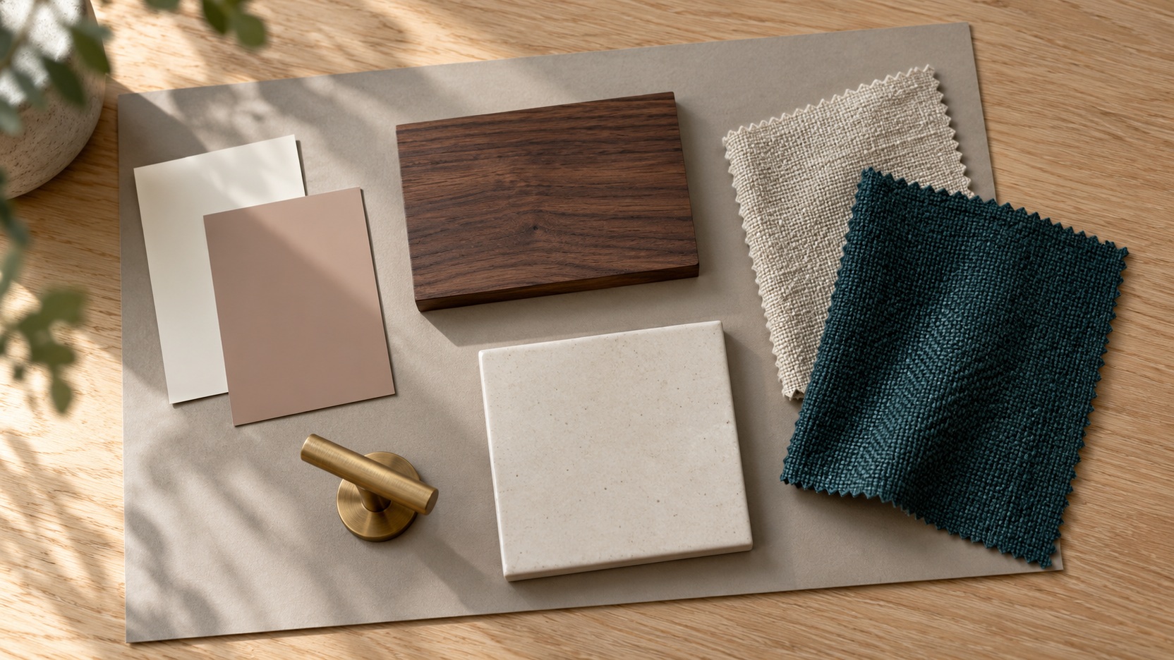
A physical board works well when texture and material comparison are central to the project. You can place fabric, wood, paint, and paper together, move them around, and look at the combination in the room. Use removable attachments while choices are still changing. A simple backing board or a clear tabletop can be sufficient; presentation polish is less important than useful comparisons.
A digital board is convenient for arranging photographs, comparing furniture silhouettes, and sharing an evolving direction. Keep the layout simple enough to revise without a long editing session. Digital images vary in lighting and color accuracy, so treat them as a composition aid rather than proof that two physical finishes match. You may find that a digital overview and a small physical sample group work best together.
Build the Palette From the Largest Surfaces
Begin the material arrangement with the finishes that occupy the most visible space. A floor sample, wall color, and main upholstery fabric deserve more influence than a small decorative object. Give them enough room on the board to judge their relationship. A tiny pale swatch beside a large picture of a dark chair can exaggerate the chair’s importance to the proposed room.
Differentiate background colors from accents. The same rust fabric may feel balanced as one cushion and overwhelming as a full sofa, depending on the room. You do not need mathematically exact proportions on the board, but its visual emphasis should roughly reflect your intention. This makes it easier to notice when every proposed item is trying to become the main feature.
Include texture alongside color. Smooth cotton, loosely woven linen, glossy tile, and matte wood can create different effects even when their colors are closely related. Place samples together in the room’s normal light and view them from more than one angle. Materials that appear harmonious in a flat digital image may have a different relationship once their sheen and texture are visible.
Add Furniture Shapes Without Turning It Into a Shopping List
Introduce the forms that will establish the room’s character: a curved upholstered headboard, a slender metal lamp, a broad wooden cabinet, or a chair with open arms. Focus first on how their shapes work together. If every piece is sculptural and attention-seeking, the room may need a quieter supporting element. If everything has the same outline, one contrasting form may provide useful interest.
Keep exact product selection separate until the main direction is convincing. A reference chair can represent a low, relaxed silhouette without becoming the chair you must buy. Once you identify a real candidate, check its dimensions, construction, price, and availability outside the visual board. The board should help evaluate purchases rather than make an unsuitable purchase feel inevitable.
Show the Role of Light and Pattern
Lighting references should communicate an effect as well as an attractive fixture. A photograph of soft light across a headboard tells you something different from an isolated pendant image. Identify where you need task light and where a gentler ambient effect would be welcome. Keep those functions in mind as the fixture shapes join the board.
For pattern, compare scale rather than color alone. A broad stripe, a small check, and a loose botanical print may coexist more comfortably when each has a distinct visual role. Several equally busy patterns can compete even if their colors coordinate. Show enough of each pattern to understand its repeat instead of cropping it into a misleading fragment.
Remember that a pattern may look different at room scale. A delicate print visible in a close photograph could read almost like a solid fabric across the room. A large motif may dominate a small cushion more than expected. Keep a sample or accurate product image available when making final decisions about where the pattern belongs.
Test the Board Against Everyday Life
Imagine a normal weekday in the proposed room and look for gaps. Where will a book land, how will clothing be put away, and which surface is needed for a drink or a charging device? These uses do not all need pictures on the board, but they should shape the choices it contains. A mood that depends on every practical belonging being hidden may require a storage solution the board has not yet acknowledged.
Check maintenance and household suitability before treating materials as approved. Pale upholstery may fit the atmosphere while requiring care you do not want, and a loosely woven textile may be unsuitable for a pet’s favorite seat. Look for alternatives that preserve the desired texture or color while better supporting daily use. Adjusting one material can protect the whole direction from becoming frustrating.
Resolve Conflicting Preferences With Separate Options
If two people prefer different directions, create two small alternatives around the same fixed room rather than crowding both into one board. Keep the practical requirements identical so the comparison remains fair. One version might use pale walls and deep textiles, while the other reverses that relationship. This makes the disagreement concrete enough to discuss without relying only on broad statements about style.
Identify the parts both people want to retain. You may share a preference for warm wood and comfortable fabrics even while disagreeing about color. Those common elements provide a base for a third, more considered combination. Change one major variable at a time so you can see which adjustment actually improves the shared response.
When reviewing the options, describe the intended experience rather than simply voting for individual objects. A person may dislike a particular chair while liking the calm atmosphere it helps represent. Separating the object from its role creates room for alternatives. The final board should explain a direction both people understand, including any compromises that still need a physical sample or layout test.
Turn the Finished Board Into a Decision Tool
Save a clear final version and keep the important samples with it. Record the materials or qualities that are approved, and distinguish them from unresolved possibilities. This prevents a placeholder image from becoming an accidental instruction to buy a specific item. Keep a separate practical list for measurements, costs, delivery details, and the order in which work must happen.
A completed board for a reading bedroom could contain a photograph of the retained oak bed, warm off-white wall and curtain samples, a rust quilt swatch, and one image of a shaded adjustable lamp. A darker flooring sample records what will stay. A brass pendant might be rejected because its scale and installation introduce work the brief does not need. Beside the board, the measured plan confirms the chair position. The result explains a coherent decision: warmth through timber and cloth, useful local reading light, and little additional furniture.