Choose Colors That Belong to the Same Home
A home can contain many different colors and still feel coherent when those colors have clear relationships. The living room does not need to match the bedroom, and the bathroom does not need to repeat the kitchen exactly. What helps is a considered thread: a shared undertone, a recurring accent, a familiar wood finish, or a similar level of contrast. Choosing that thread before buying paint makes room-by-room decisions easier because each new selection has something concrete to respond to. Start with the materials you will keep, look carefully at the views between rooms, and develop the palette in the lighting where it will be used. The result can be colorful or restrained, but it should feel connected through actual spaces rather than only through a group of attractive swatches.
A: No. Shared materials or related accents can connect rooms with different wall colors.
A: Compare candidates directly beside the flooring and other retained materials.
A: They can, but judge the transition through the real doorway or open-plan sightline.
A: It is a recurring relationship, such as a shared undertone, material, accent, or contrast level.
A: Different lighting and nearby finishes can change its apparent color.
A: Begin with the tile and other fixed finishes, then test under the room's normal lighting.
A: Yes. Check its furniture, evening lighting, and the view from adjoining rooms.
A: No. Choose a visually comfortable atmosphere while considering the room's other conditions separately.
A: Consider their shared view and repeat a material or supporting color thoughtfully.
A: Keep the color identifier, product and finish, room location, and useful matching material samples.
Make an Inventory of Colors You Already Own
Walk through the home and identify the large surfaces that are staying. Flooring, stone counters, tile, cabinets, substantial upholstery, and curtains all contribute color before new paint arrives. Include the pieces you love as well as the finishes you simply cannot replace. A practical palette has to accommodate both, and acknowledging an awkward fixed material early is easier than trying to solve the conflict after the walls are painted.
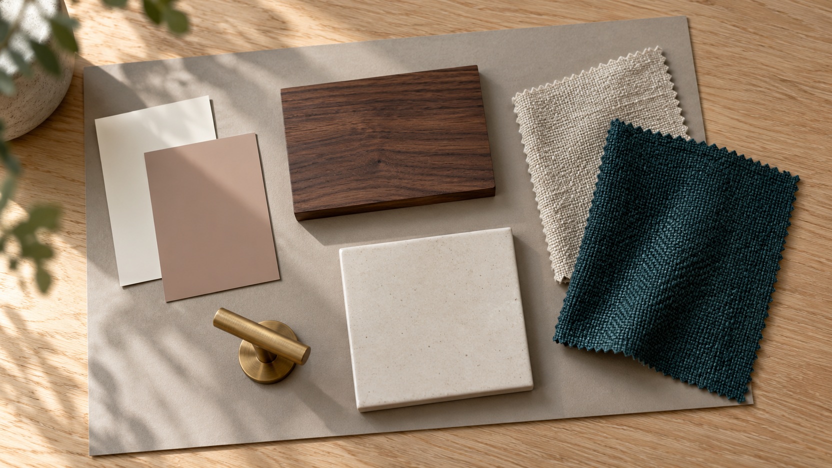
Gather physical samples where possible and take photographs for reference. Photographs are useful for remembering the overall room, but they should not replace direct comparison of colors. A sample of the actual fabric or flooring can reveal undertones that are easy to miss on a screen. Keep these materials together while developing the scheme so a promising new color is always judged against the home it must join.
Map the Views Between Rooms
Stand in the entry and look toward the main living spaces. Then repeat the exercise from the sofa, the kitchen, and the ends of connecting hallways. Notice which walls can be seen simultaneously and where a doorway creates a clear break. These sightlines influence how much connection the rooms need. Two distant rooms can have very different palettes without ever appearing beside one another.
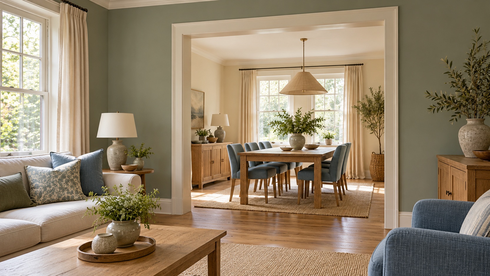
Open-plan areas usually benefit from considering the whole view before treating each activity zone separately. The kitchen cabinets, dining chairs, and living-room upholstery may appear together even though they serve different functions. You can distinguish the areas through changes in emphasis while retaining a shared background or accent. That relationship is often more comfortable than introducing several unrelated wall colors inside one continuous space.
Record the main connections in a simple sketch. It need not be a technical floor plan; arrows between visible rooms are enough to show where decisions interact. Use it when assessing bolder choices. A dramatic dining room might be exactly right, but the view from the pale living room deserves consideration before you commit to the contrast.
Set the Whole-Home Thread Before Choosing Every Room
Choose one or two relationships that can recur naturally. Perhaps warm white trim and medium oak run through the house, while blue appears in different strengths. Another home might connect rooms through earthy colors and dark metal details. The thread should suit the actual materials and your preferences, rather than impose a style that requires replacing everything you own.
Keep the organizing idea flexible. Repeating a color does not mean using the identical paint on every wall. A green cabinet, a muted green bedroom textile, and a pattern containing green in the living room can provide a quieter connection. The recurring element becomes useful because it helps explain the differences between rooms without eliminating them.
Start the Living Room With Its Largest Commitment
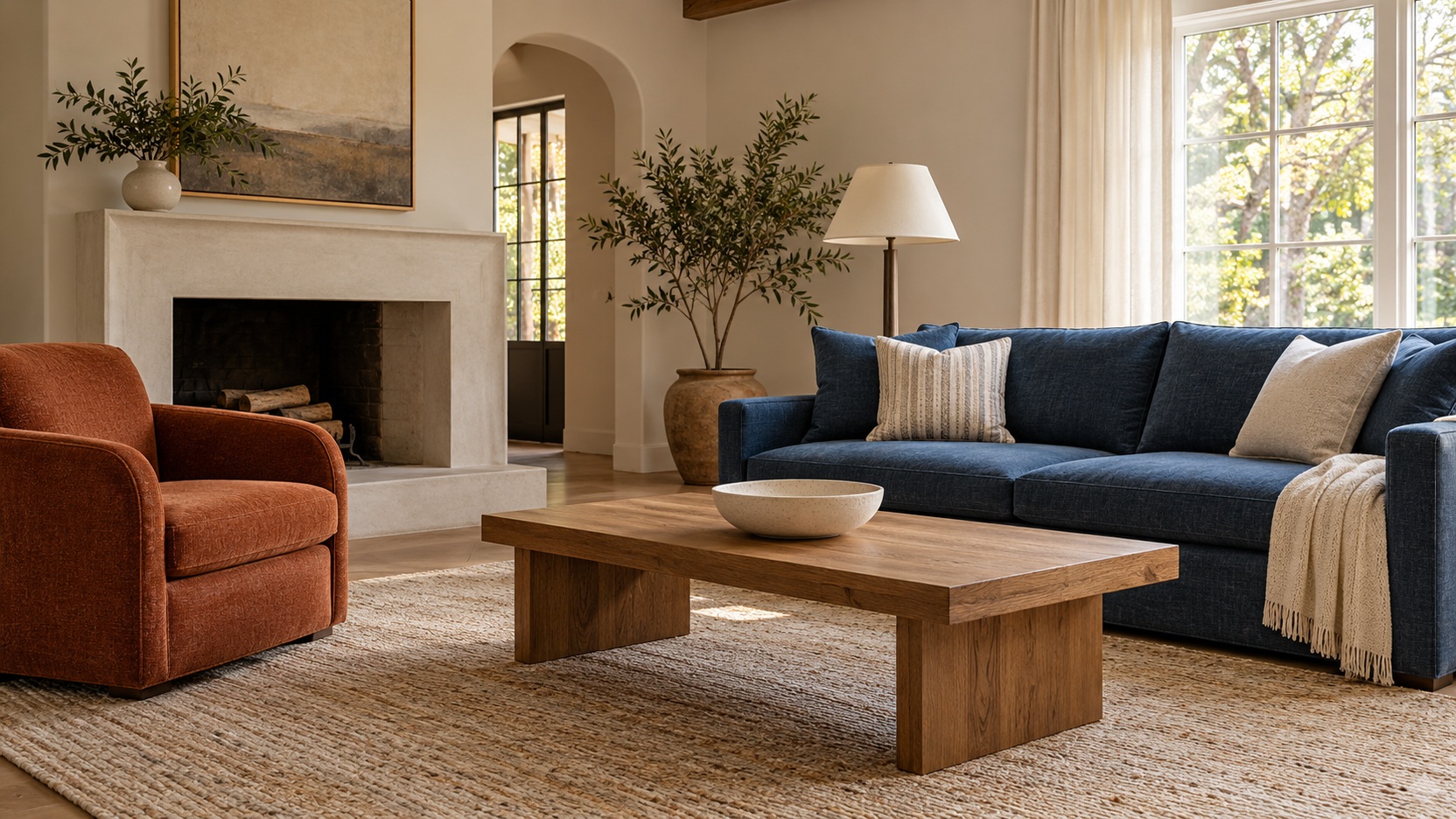
In a living room, a retained sofa or rug often gives you the strongest starting point. Compare possible wall colors beside that item and the flooring before looking at isolated paint cards. If you are replacing the sofa, consider its fabric and the wall color together, but avoid ordering several major pieces before seeing how the materials interact. A large upholstered surface can influence the room much more than a small accent swatch suggests.
Give the palette a clear balance between background, anchor, and accent. A pale wall may support a deep sofa, with a warmer color appearing in a chair or artwork. These are roles rather than fixed percentages. A room with extensive windows and shelving has different available surfaces from a simple rectangular room, so the most pleasing proportions must come from its actual arrangement.
Look at the room during the hours you use it most. A color selected in bright morning light may feel quite different during an evening of reading or television. Include the lamps and window treatments you intend to keep in the comparison. Your preferred palette should remain comfortable through normal conditions, even though its appearance will naturally shift.
Let Kitchen Finishes Lead the Comparison
Kitchens often contain several fixed materials close together, making direct comparison especially useful. Look at cabinets, counters, backsplash, floor, and adjacent walls as a group. A white countertop may reveal a warm or cool cast beside another white surface. Instead of assuming every neutral is interchangeable, compare candidate paint colors where the finishes meet.
Use the kitchen’s connection to nearby rooms to guide the final choice. If the cabinetry has a strong color, the adjoining dining area may need less additional competition. If the kitchen is mostly neutral, a recurring textile or furniture color can connect it to the living space. You can build continuity through a few visible elements without introducing more painted surfaces.
Give Dining Areas Their Own Emphasis
A separate dining room can take on more depth if you enjoy a focused atmosphere for meals. Consider the color of the table, chairs, and any large sideboard before selecting the walls. Deep paint beside dark furniture creates a different effect from the same paint beside pale wood. The room’s identity comes from the combination, not from the wall color alone.
Check the relationship to the next room through the doorway. You might repeat an accent from the living room in a deeper version, or retain the same background while changing textiles and art. Either approach can give the dining room distinction. What matters is that the transition feels intentional from the views people encounter most often.
Test the palette under the lighting used for dinner. Reflective finishes, shaded pendants, and candlelight can change the atmosphere from the daylight view. If the table also supports work or homework, consider both uses rather than designing solely for a formal evening setting. A flexible room should feel comfortable in the situations that happen regularly.
Choose Bedroom Color Around Your Preferred Atmosphere
Decide what you want the bedroom to feel like before settling on a familiar category such as blue or beige. Some people enjoy a pale, open room; others prefer deeper walls and a more enclosed feeling. Neither preference is a universal sleep prescription. Color supports personal comfort and visual atmosphere, while the room’s light, noise, temperature, and routines have their own roles.
Compare wall candidates with the headboard, bedding, and largest storage pieces. A warm wood bed can make a muted green feel different from the same green beside cool gray upholstery. Keep your main bedding samples nearby, and allow the palette to work when the bed is made simply. A room that depends on many decorative cushions to connect its colors can become inconvenient in everyday use.
Read Bathroom Colors Beside Tile and Skin
Bathroom choices deserve attention to the materials that are hardest to change. Place samples beside the tile, sink, counter, and flooring rather than judging them alone. Two whites may appear harmonious in a store and clash when installed together. A wall color that acknowledges the undertones of the existing surfaces can make an older bathroom feel more considered without requiring replacement finishes.
Observe the color near the mirror with the usual lighting on. The reflected effect matters because this is where grooming tasks happen. If you dislike a strong surrounding hue near your face, reserve it for towels or a smaller painted element. Practical preferences should shape how much color the room receives.
Choose the appropriate paint system and finish for the surface and conditions, following the manufacturer’s guidance. Color and coating suitability are related decisions but not identical ones. A beautiful shade still needs an appropriate product where moisture, cleaning, or wear are concerns. Check those requirements before ordering the final quantity.
Use Hallways to Manage the Transitions
A hallway can provide a visual pause between rooms with different identities. A shared neutral may make those transitions easy, especially when several doorways are visible at once. Compare it with the trim and flooring along the entire route. A color that looks ideal at the bright end of the hall may feel different in its darker center.
Alternatively, a stronger hall color can become the home’s connecting statement. This works best when you consider the glimpses into adjoining rooms as part of the composition. Repeat or acknowledge the hall’s color elsewhere if it needs help belonging. Keep practical visibility and the mood you enjoy in mind rather than choosing a dramatic transition solely for novelty.
Test the Shortlist in Every Intended Room
Reduce the choices to a manageable shortlist before sampling. Large sample areas or movable boards are easier to compare than tiny chips, particularly beside substantial furniture. Follow the sample product’s instructions and remember that a sample coating may differ from the final finish. You are testing the color relationship while also checking the details of the intended paint system.
Move through a normal day with the samples in place. Look in changing daylight and under the actual evening lights, checking how each candidate relates to the materials around it. Sample colors in every intended room because differences in lighting can change their appearance. A repeated paint color should therefore be checked in each location, even when it has already worked elsewhere in the home.
Evaluate candidates against the retained materials rather than against one another indefinitely. A neutral can appear unusually pink or green beside a competing sample, distracting from how it will look in the completed room. Once you have identified a likely choice, review it on its own with the relevant finishes. The final decision should address the whole setting.
Keep a Palette Record You Can Use Later
Save the approved paint information, finish, and room location, along with the fabric and material samples that informed the choice. A simple record helps when touching up, replacing curtains, or shopping for a new chair. Store it where it will be accessible rather than relying on memory or an old screenshot. Similar-looking colors can be difficult to distinguish once their original labels are lost.
Let the scheme evolve as your household changes. A coherent home does not require every future object to pass an exact color-matching test. Keep the main relationships clear and introduce new pieces thoughtfully. The palette has done its job when it supports comfortable rooms and makes later choices easier, while leaving enough freedom for those rooms to remain personal.
Put the Decisions in a Practical Order
In a connected downstairs space, warm oak flooring might provide the thread between a cream living room, a muted green kitchen, and a deeper olive dining room. The green changes emphasis instead of repeating at equal strength everywhere. Upstairs, a dusty blue bedroom could keep the same warm trim and timber while taking a quieter direction. Its difference feels intentional because the shared materials remain recognizable. This approach gives each room a job within the home and makes a later textile change less likely to start an unnecessary repainting project.