Find a Living Room Palette You Want to Live With
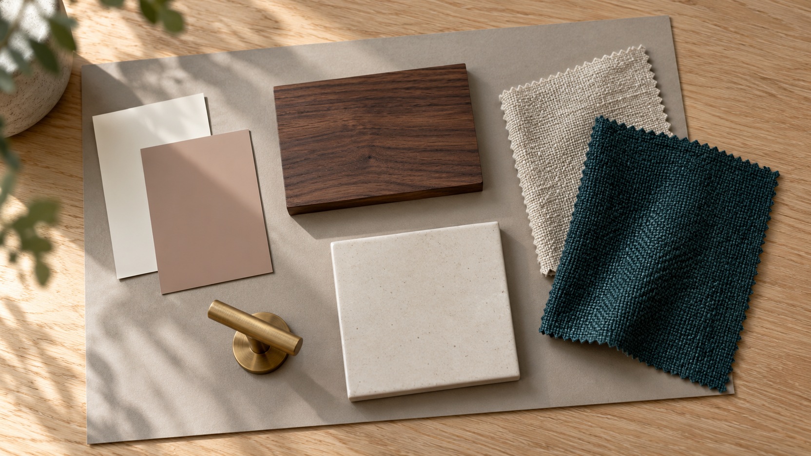
A useful palette connects walls, furniture, and smaller objects while leaving space for belongings you love. These fifty combinations offer suggested balances and different moods, rather than fixed recipes or specific paint matches. Colors such as cream or sage vary between materials, so develop your selection from actual samples. Consider what you are keeping, how much contrast you enjoy, and whether you use the room mostly in daylight or after dark. Shortlist combinations that suit those conditions before committing to major changes.
A: No. They are design combinations to develop using actual paint, fabric, and finish samples.
A: Begin with the sofa's actual fabric and compare supporting colors beside it.
A: Yes. Give them distinct roles and consider how much surrounding visual relief you prefer.
A: No. Three colors offer a useful starting relationship, not a limit on the room.
A: Vary texture and value, and consider a deliberate darker anchor.
A: It is one option; judge the ceiling alongside the room's architecture and other surfaces.
A: Yes. Compare their actual colors and visual weight rather than requiring identical species.
A: The room's artificial lighting changes how its materials appear together.
A: Test it through a movable textile or accessory in the intended location.
A: A few repeated color relationships and clear anchors can connect varied belongings.
Soft Neutrals With Enough Depth
1. Ivory, oatmeal, and walnut. Let ivory occupy the largest surfaces. Oatmeal upholstery adds a gentle step in depth, while walnut tables provide definition. This suits a room where texture should carry more interest than strong color.
2. Warm white, mushroom, and black. Mushroom softens the transition between pale walls and dark accents. Use black in a few deliberate outlines. A lamp frame or narrow table base can establish enough structure without dominating the room.
3. Cream, camel, and bronze. Camel brings warmth to a pale seating area. Bronze can appear through hardware or a substantial light fitting. Keep some finishes matte so the metallic element feels considered rather than scattered everywhere.
4. Putty, flax, and chocolate. Putty walls create a muted setting for flax-colored fabric. Chocolate contributes a richer anchor through a chair or cabinet. The result can feel quietly substantial without relying on bright white contrast.
Blue Palettes for Different Moods
5. Navy, chalk white, and oak. A navy sofa gives the room a clear center. Chalky walls provide relief, and oak prevents the contrast from feeling overly formal. Leave the wood grain visible through simple furniture shapes.
6. Powder blue, cream, and pale gray. Keep the blue soft enough to sit comfortably beside both neutrals. Cream adds warmth where gray might feel chilly. Distinguish the fabrics through weave so the pale combination retains depth.
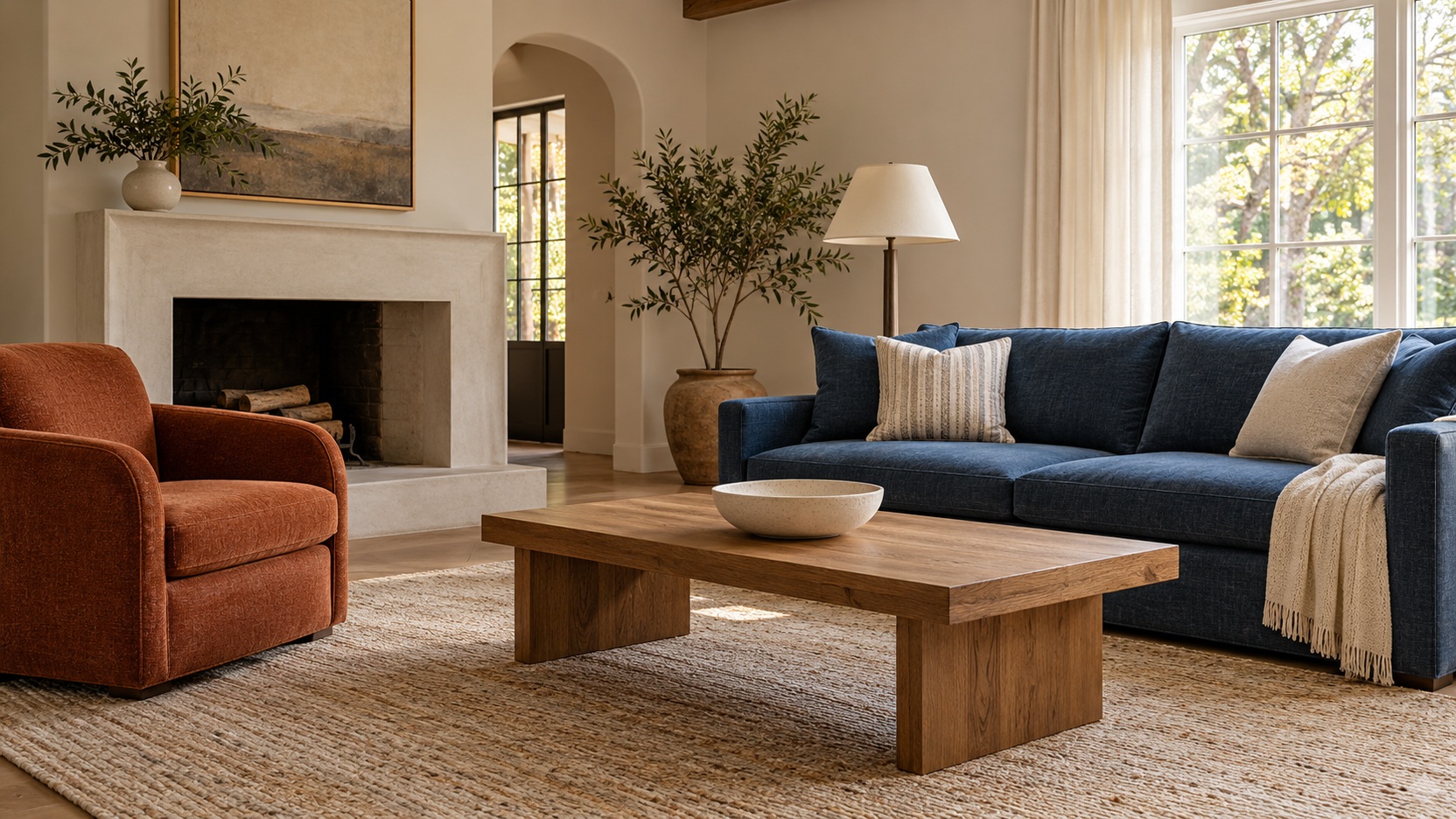
7. Denim, rust, and sand. Denim offers an easygoing main color for upholstery. Rust adds a warmer counterpoint in limited areas. Sand can connect the pair through a rug, curtains, or the broader background of patterned fabric.
8. Slate blue, tobacco, and ivory. Tobacco leather gives slate a grounded partner. Ivory prevents both deeper colors from closing in around the seating. This combination works especially well when the furniture has generous but uncomplicated lines.
9. Ink blue, plum, and antique brass. Treat ink as the main dark field. Plum brings a subtle change in color rather than a large change in brightness. Antique brass provides small highlights among the deeper surfaces.
10. Sky blue, butter yellow, and warm white. Sky and yellow can make a cheerful pairing without becoming highly saturated. Let warm white separate their strongest areas. A small patterned textile can explain how the two colors belong together.
Greens That Connect With Natural Materials
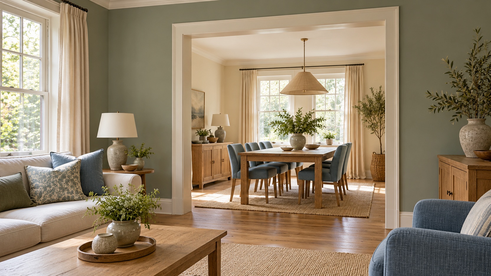
11. Sage, linen, and honey oak. Sage offers a restrained wall or sofa color. Linen keeps the larger textile areas light. Honey-toned oak contributes warmth, making the combination useful where you want softness without an entirely neutral room.
12. Olive, cream, and dark brown. Olive can take the lead through upholstery or walls. Dark brown makes the scheme feel settled. Cream belongs where light is most needed, such as curtains, a rug, or a secondary chair.
13. Forest green, blush, and walnut. Forest green gives blush a mature setting. Walnut connects the depth of the green to the softer pink. Avoid making both accent colors equally prominent if the room is already visually busy.
14. Eucalyptus, stone, and charcoal. The grayness in eucalyptus makes stone a natural companion. Charcoal supplies a controlled edge. Try the darker color on a fireplace surround, cabinet, or occasional table rather than repeating it everywhere.
15. Moss, ochre, and off-white. Moss and ochre create an earthy relationship with noticeable color. Off-white gives the eye somewhere to pause. Natural fabric and understated pottery can support the palette without introducing another competing hue.
Warm Earth Colors With Character
16. Terracotta, bone, and warm oak. Terracotta can appear through a chair or broad textile rather than all the walls. Bone softens its intensity. Warm oak extends the earthy quality through furniture you can retain across later changes.
17. Clay pink, olive, and cream. Clay pink feels softer than a clear coral. Olive introduces an opposing earthy note. Cream can occupy enough space to keep the combination relaxed, especially when the room contains several large furniture pieces.
18. Cinnamon, pale blue, and ivory. Cinnamon gives pale blue an unexpected warm partner. Keep one of them dominant. Ivory bridges the contrast and allows patterned cushions or artwork to repeat both colors without feeling disconnected.
19. Sienna, charcoal, and flax. Sienna supplies a strong warm identity. Charcoal adds depth in a few grounded elements. Flax textiles can soften the room’s overall appearance and prevent the deeper colors from making every surface feel heavy.
Grays With Thoughtful Supporting Colors
20. Dove gray, cream, and sage. Dove gray provides a quiet upholstery base. Cream keeps the palette from leaning entirely cool. Sage offers a gentle color change that can move between cushions, artwork, and a painted cabinet.
21. Charcoal, caramel, and white. Caramel brings warmth beside charcoal seating or walls. White marks a clear break between the deeper areas. Use it in substantial surfaces so the room does not become a collection of dark objects.
22. Warm gray, dusty rose, and walnut. Dusty rose introduces softness without a sugary effect. Walnut gives it a more substantial setting. Compare the actual gray and pink materials closely, since their undertones influence how comfortably they sit together.
23. Silver gray, navy, and ivory. Navy creates a more definite anchor than gray alone. Ivory adds a warmer neutral around the pair. A rug containing all three can help connect furniture in different shades and finishes.
24. Graphite, pale oak, and muted teal. Graphite supplies the scheme’s darkest value. Pale oak gives the eye a contrasting natural surface. Muted teal can remain a concentrated accent, such as a chair, rather than competing with every wooden piece.
25. Greige, aubergine, and brass. Greige lets aubergine stand out without stark white contrast. Brass introduces a warmer point of reflection. Keep the purple in a material you enjoy seeing at close range, such as velvet or a woven rug.
Richer Rooms With an Evening Character
26. Burgundy, parchment, and dark wood. Burgundy makes a strong upholstered anchor. Parchment lightens the background while preserving warmth. Dark wood reinforces the scheme’s depth, so leave some simpler surfaces between substantial furniture and patterned textiles.
27. Petrol blue, ochre, and cream. Petrol sits between blue and green, giving ochre a rich counterpoint. Cream can keep the relationship open. Try one small sample arrangement before committing to large upholstered pieces in both strong colors.
28. Espresso, tobacco, and ivory. Espresso and tobacco create depth through related browns. Ivory makes their differences easier to see. Vary sheen and texture deliberately so the room has definition even though its main colors remain closely related.
29. Deep teal, coral, and walnut. Coral provides a lively interruption to deep teal. Walnut keeps the combination grounded. A small amount of coral can travel far visually, so begin with artwork or cushions before choosing a large piece.
30. Plum, olive, and warm white. Plum and olive bring contrasting color at a similar depth. Warm white makes them easier to balance. Choose different textures for the two hues so their furniture shapes remain clear beside each other.
Gentle Color for an Airier Room
31. Blush, cream, and natural oak. Blush can function almost like a warm neutral when muted. Oak adds a familiar natural element. Cream creates a soft backdrop, while a few darker outlines can define furniture without changing the gentle mood.
32. Peach, pale gray, and ivory. Peach lends warmth to a mostly pale room. Gray introduces a quieter opposing note. Keep the peach restrained if the space receives warm evening light, and check that ivory still looks distinct beside it.
33. Lavender, oatmeal, and walnut. Oatmeal makes lavender easier to integrate with everyday furniture. Walnut adds depth beneath the paler colors. Use the lavender in a grayish shade if you want the result to feel understated rather than highly decorative.
34. Misty aqua, sand, and white. Aqua provides a light color note without requiring a coastal theme. Sand warms the larger textiles. White can sharpen selected edges, especially where the room has curtains, trim, or shelving already in that color.
High-Contrast Combinations With Clear Anchors
35. Black, ivory, and cognac. Cognac leather softens the graphic relationship between black and ivory. Keep each major furniture shape legible. A simpler rug can help when the room already contains strong contrast in shelving or window frames.
36. White, cobalt, and warm wood. Cobalt becomes the unmistakable focal color against white. Warm wood prevents the setting from feeling entirely crisp. Give the blue a defined role, such as one substantial chair or a coherent group of ceramics.
37. Charcoal, blush, and pale stone. Blush offers a soft counterpoint to charcoal. Pale stone supplies a broader neutral field. Rounded upholstery or a gently curved table can complement the color contrast without requiring every piece to share a shape.
38. Navy, burnt orange, and cream. Burnt orange brings concentrated warmth to navy’s depth. Cream creates space between them. Let the stronger pair appear at different scales so the room has an anchor and an accent instead of two competing centers.
39. Emerald, white, and black. Emerald delivers a clear jewel-tone statement. Black can define furniture frames and selected details. White needs enough presence to separate those darker elements, particularly if the room has a compact footprint.
40. Chocolate, pale pink, and off-white. Chocolate makes pale pink feel grounded and substantial. Off-white keeps the relationship readable. Consider pink for a large soft textile if the room already has several brown wood pieces that will remain.
Relaxed Palettes With a Collected Feel
41. Indigo, faded red, and natural linen. Faded red brings a lived-in warmth beside indigo. Linen gives both colors a quiet background. Vintage-style patterns can connect the combination, but leave some plain areas to preserve its relaxed character.
42. Muted turquoise, rust, and cream. Turquoise adds a cooler note to rust’s earthy warmth. Cream helps their relationship feel easy. Choose softened versions of both colors when the room contains an eclectic assortment of furniture and art.
43. Ochre, olive, and dark walnut. Ochre introduces brightness without a sharp primary yellow. Olive gives it a grounded companion. Dark walnut contributes a substantial outline, making lighter textiles useful around the larger seating pieces.
44. Brick red, denim, and oatmeal. Brick and denim offer familiar, approachable color. Oatmeal softens the contrast. Repeated threads in a rug or cushion can connect them while allowing inherited furniture to remain part of the room.
Unexpected Pairings to Test in Small Amounts
45. Aubergine, mustard, and pale oak. Mustard introduces a lively highlight against aubergine. Pale oak lightens their combined depth. Test the balance through movable accessories before choosing a major piece in either of these distinctive colors.
46. Dusty blue, oxblood, and ivory. Oxblood adds depth and warmth beside a softened blue. Ivory keeps the combination from becoming too dense. A small upholstered bench or leather accent can establish the darker color without taking over.
47. Coral, olive, and parchment. Coral feels more grounded beside olive than beside bright white alone. Parchment gives them a warmer background. Let the strongest saturation appear in a limited area until you know how much energy you enjoy.
48. Butter yellow, chocolate, and cream. Chocolate gives a pale yellow room a definite anchor. Cream can connect the softer surfaces. Natural wood and woven textiles help the combination feel layered rather than dependent on matching painted pieces.
49. Sage, lilac, and warm gray. Sage and lilac offer a gentle contrast between green and purple. Warm gray moderates the pair. Compare fabrics together in the room so the softness remains intentional rather than washed out.
50. Terracotta, ink, and pale pink. Terracotta supplies warmth, while ink provides a deep outline. Pale pink softens their meeting point. Keep some areas uncomplicated so these three distinct colors can be appreciated without additional competing accents.
Turn a Shortlist Into Your Own Room
Choose three candidates that work with the largest items you are keeping. Give each color a role before buying anything: a broad background, a main furniture color, or a smaller accent. The proportions will depend on the room, so do not treat any numerical decorating rule as a requirement. A palette succeeds when the actual surfaces feel balanced together.
To shortlist the fifty combinations, choose three that work with your largest retained piece. Compare each as a broad wall background, a substantial upholstery area, and a smaller accent. Beside a brown leather sofa, for example, cream can supply the background while muted green appears in a curtain or chair. Compare that relationship with a blue-based alternative before buying smaller accessories. The useful winner is the combination whose large areas belong together.